Nathan Richard Alcala
Artist Statement
My art may look like a chaotic storm of various things, but in reality it is the presence of my mind. The tile I made for this is: "The Chaos of One's Mind".
I created my art using paint markers, watercolors, tracing images, magazine cutouts, and pen in some places.
What inspired my artwork was seeing various other artworks with the theme of ADHD. My work expresses my personal issue of having ADHD. I just wanted to show the main issue, there isn't really a "main" emotion.
My goals for this piece was just to find a way to express the constant chaos within my big, imaginative mind.
What I learned in creating this artwork is how to use multiple techniques in order to create a amazing art piece. The outcome was basically what I had expected from the sketches, just some minor changes here and there.
25 Things About Me Art Piece


Artist Statement
I painted my pumpkin based on the character symbols for a game I love to play called Limbus Company. I used the character symbols of Ishmael, Yi Sang, Faust, and Heathcliff, and for the final symbol, I used the clock, which is the head of the main player character, whose name is Dante.
What I used to make this art was mainly acrylic paint, with some usage of paint markers for the symbols.
The inspiration for this came completely out of the blue, but I decided to act on this random inspiration, and I eventually got this as a result.
My goal for this art piece was to make something that represented at least 4 of the 12 Sinners on my pumpkin.
What I learned was to use multiple coats, especially for an actual, organic pumpkin, because the paint does chip off badly.

Halloween Pumpkin Painting
Veggie/Fruit Painting
Artist Statement
My art is based on a macro photo of Roma Tomatoes. I created it via using Acrylic paint and a canvas. The big idea behind my artwork is that it represents the Roma Tomatoes that my Mom first grew when she was becoming a big green thumb, which is a moment I am fond of. The goal of this artwork was to show my skills and to create something that I can reminisce on from time to time about my mom. What I learned in this artwork was how to shade well and efficiently.

Artist Statement
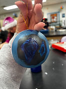
My art is an ornament that has 2 sides, said sides are based on 2 elements from the video game, Destiny 2, Stasis and Solar, respectively. The title of my work is Duality. I made this using a blank ornament and splitting the project into two sides with differing color palettes. The big idea behind the artwork is that it's a gift for my dad, who loves Destiny 2; in fact, I was the one who initially introduced my dad to the Destiny franchise! My goal for the project was to make a suitable gift for my dad, as I want to congratulate him for being a good dad gamer. My overall thoughts about my project are that it is a pretty high-quality artwork coming from me, but I did do well.


Anything But A Canvas project
Artist Statement
My art is a project that involves taking a watercolor animal drawing outside the painting's borders and placing it on a pen-and-ink background. I created my watercolor art using the wash and wet-on-wet techniques. I made my pen-and-ink background with 2 pen-and-ink techniques. Of which were cross-hatching and hatching. The big idea behind this is that my mom and I love sea turtles, and I wanted to do this for her. My goal for this artwork was to challenge myself, and challenge myself I did. It was hard drawing the sea turtle, but I am glad I did so well on this.

Beyond the Border Project
Artist Statement
-
Bubble
-
1: This technique consists of using a combination of soap/bubble mixture and water colors to make bubbles to put onto paper, the colors I used in the first one is a old version that used a old version of the bubble mixture to make the bubbles, I chose the red and blue colors because it is a Iconic color to use against each other and mix together.
-
2:The colors I used for the 2nd iteration of this were more refined because of the Improved way we made the bubbles.
-
-
Ink Blowing
-
This technique consists of putting drops of watercolor onto paper and then using a straw to blow it in any direction one wants to, and this can be used with any color the artist desires. I at first used RGB colors because they were primary colors, then I used some secondary colors which helped with making the piece look good.
-
-
Paint Marbling
-
1: This technique consists of colored ink onto water, where it stays at the top, one must make sure not to put too many drops or else the ink will sink to the bottom. The artist has to use something to manipulate the ink how they want to or else the ink will just stay there. The artist then, once they're satisfied with the ink pattern, the artist must turn their paper over, and without hesitating, put it into the tray which the ink is in, this will put the ink onto the paper, but also, the artist must pat down the sides of the paper as well to ensure proper application. The colors I chose were a test, but I wanted a comparison between the light of the sun and the ocean.
-
2:I chose the colors of Red, Green, Blue because I wanted to show how all 3 could blend together.
-
-
Smoke Painting
-
This technique consists of you lighting a candle, putting the tip of the flame up to a paper and then moving the candle or the paper around to draw out shapes or patterns. I chose the pattern I did because I wanted a sky with something in the middle that was up to viewer interpretation.
-
-
Paint Pouring
-
This technique consists of the artist mixing Floetrol and acrylic paint to make a easily pourable paint mixture, while also being able to mix with other colors as well. I chose the colors I did because I wanted to make a sunset aesthetic for the background before I painted the black sun on there.
-
Art Studio
2026 Creations


Artist Statement
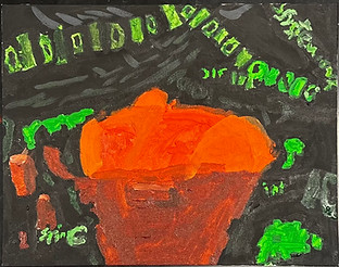
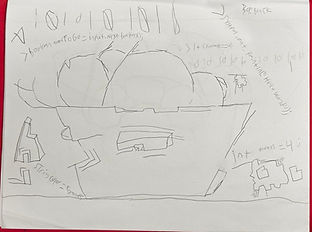
My project was to do a cubism piece, and I based it on a picture on a bowl of oranges which is seen in the fourth photo below. I made this using acrylic paint and I tried to make all as straight as I could, as thing is, straight lines are what I'm best at in terms of art. The big idea behind my artwork was to show what my interest in terms of career path is, which is technology, which is shown by the 1s and 0es and various commands. My goal for this artwork is to create the best artwork I can. And I believe I succeeded to the best of my art abilites.
Cubism Project